ADDICTION DESIGN

TIMEFRAME
2024-2025
PROJECT
CATEGORY
PRODUCTION TIME
Final degree project
UX/UI
9 months
This project analyzes addictive UX/UI patterns in TikTok, Instagram, and YouTube, and proposes ethical redesigns that promote conscious, healthy, and balanced social media usage.
DEFINING THE CHALLENGE
Problem statement
Social media is designed to keep us scrolling. Notifications, endless feeds, and algorithms make it easy to lose track of time.
I wanted to understand this behaviour and explore how these same platforms could work in a more responsible way — helping users take control without losing the fun or connection they bring.
Goal
My main goal was to design a set of features that promote conscious use of social networks.
Something realistic, that could actually fit into platforms like Instagram, TikTok, or YouTube — without making them boring or restrictive.
Role
I worked on the entire project from start to finish doing; researching how social media affects behaviour, studying existing platforms, creating design principles, prototyping new ideas in Figma and finally testing them with users and analysing feedback
RESEARCH
Methods
Literature review on UX/UI techniques, psychological impact, and ethical concerns, alongside a benchmarking and SWOT analysis of TikTok, Instagram, and YouTube.
Key findings
Addictive techniques such as infinite scroll, push notifications, recommendation algorithms, and gamification are commonly used to increase user engagement on platforms. These features can have a significant psychological impact, especially on teenagers, contributing to increased anxiety, FOMO (fear of missing out), social comparison, lowered self-esteem, and compulsive behavior.
DESIGN APPROACH
Design Principles
This part was about setting the foundation for the whole project. After finishing the research, I defined a few simple principles that would guide every design decision. The idea was to create features that make social media use more mindful without taking away its fun or social side. These principles focused on clarity, transparency, flexibility, and balance — helping users stay aware of their time, understand what’s happening on the platform, and feel in control of their experience.
Ideation
With those principles in place, I started exploring how they could come to life. I sketched quick ideas, mapped user flows, and imagined small moments of interaction that could fit naturally inside platforms like Instagram, TikTok, or YouTube. The goal wasn’t to reinvent these apps, but to suggest small, meaningful changes that help people pause, reflect, and use them more intentionally. These early concepts became the base for the prototypes developed later on.
PROTOTYPING
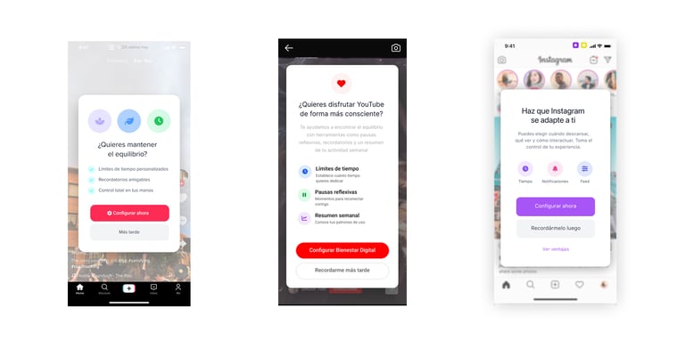
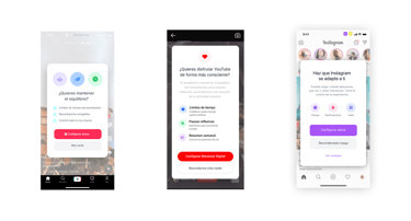
Based on the concepts, I designed and prototyped a full set of screens for Instagram, TikTok, and YouTube. Each one explores a different way of helping users manage their attention and make more intentional choices while using social media.
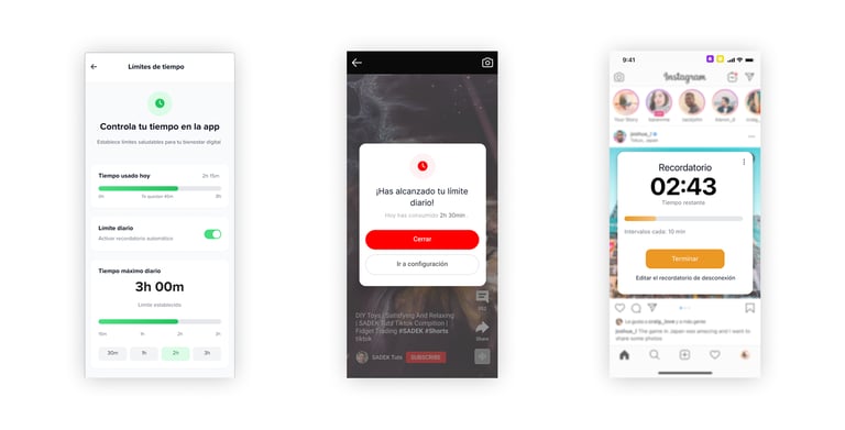
Disconnection reminder
This screen allows users to set up reminders that suggest taking breaks after extended periods of usage. It helps disrupt compulsive loops and promotes balanced engagement with the platform.
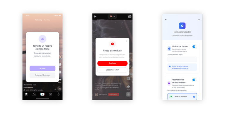
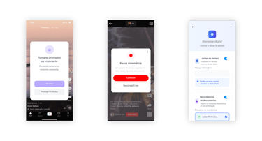
Time limits
Users can define custom daily time limits for using the app. This feature encourages conscious use, prevents excessive screen time, and supports healthier digital habits through self-regulation.
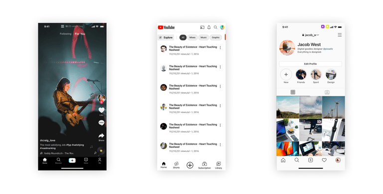
Homescreen
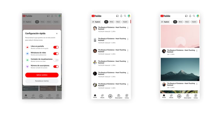
This redesigned home screen removes gamified elements like likes, visible follower counts, and public comments. The goal is to reduce social pressure and comparison, focusing instead on content over performance.
Transparency and subscriptions
This screen offers clear access to active subscriptions, billing information, and platform policies. The interface avoids dark patterns, making cancellation and modifications straightforward to ensure transparency and user trust.
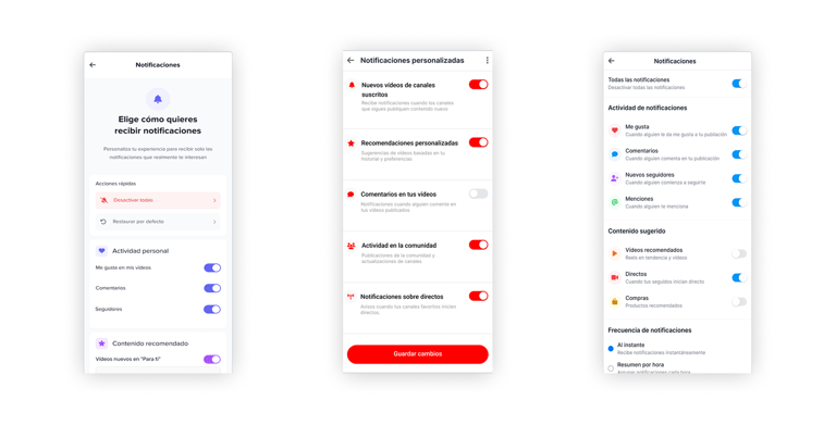
Notifications
On this screen, users can manage in detail which notifications they wish to receive and when. The design prioritizes autonomy and well-being, reducing information overload and avoiding unnecessary interruptions that feed FOMO and compulsive use.
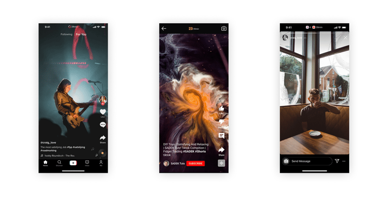
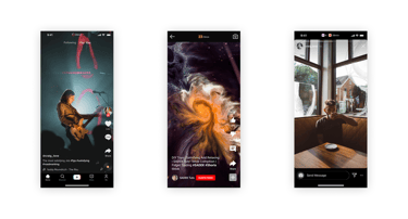
Infinite scroll
While maintaining continuous content flow, this screen integrates time indicators and pause points. It aims to reduce addictive consumption patterns and foster more mindful browsing.
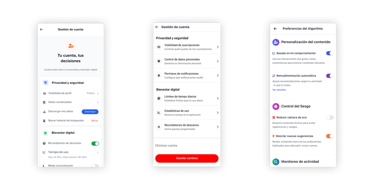
Account management
This screen provides a clear and accessible overview of personal information, privacy settings, and usage preferences. It’s designed to avoid manipulative design patterns, offering a transparent way for users to manage their data and experience. The goal is to give users real control over their account in a respectful and ethical way.
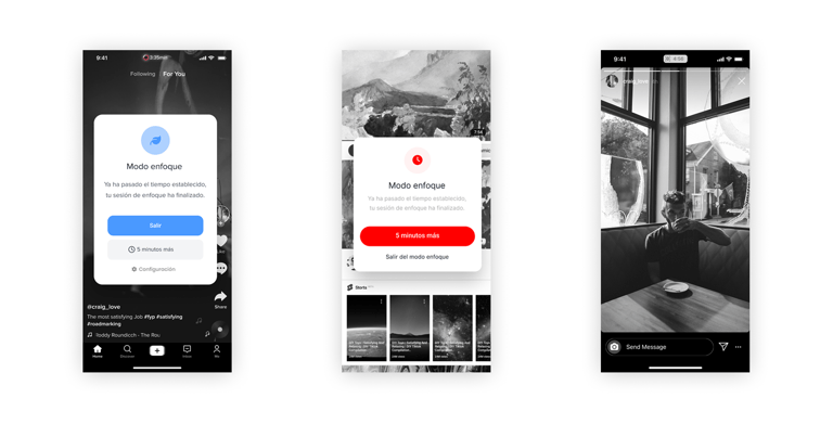
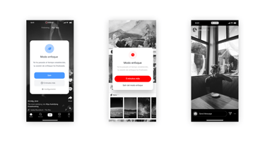
Focus mode
Focus Mode activates a greyscale display to reduce visual stimulation. It’s designed to support intentional use by minimizing distraction and breaking dopamine-driven habits.
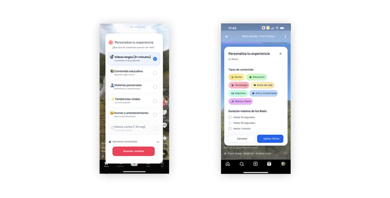
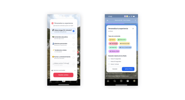
Personalize your experience
Users can customize the type of content they want to see (educational, humorous, personal, etc.) and video length. This puts the user in control, shifting away from opaque algorithmic suggestions.
Configure feed
This screen allows users to hide metrics such as likes, views, and followers. It aims to reduce external validation loops, foster neutrality, and support healthier user behavior.
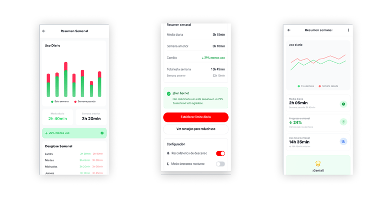
Weekly summary
This screen provides an overview of daily usage across the week, with comparisons to previous weeks. It includes positive reinforcement for reduced screen time and tools to adjust limits or reminders.
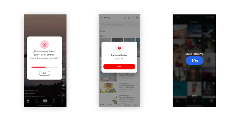
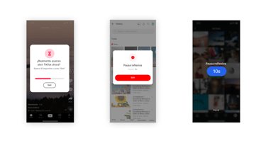
Intentional start
Before entering the app, users face a short waiting screen prompting them to reflect on their intention. This brief moment helps interrupt automatic, impulsive entry and builds digital awareness.
Time counter
Always visible at the top of the screen, the time counter shows how long the user has been active that day and how much time is left before their set limit. This reinforces time awareness and self-regulation.
Initial pop up
This screen displays a short pause before entering the app, encouraging users to reflect on their purpose for opening it. By introducing a brief moment of awareness, it aims to disrupt impulsive access patterns and foster more intentional use.
Experience personalization
This screen gives users control over the type of content they want to see (e.g., educational, humorous) and the format (such as video length). It also allows them to hide social metrics like likes and follower counts. By doing so, it reduces algorithmic influence and social pressure, promoting a browsing experience based on personal interest and emotional comfort.
USER TESTING
Process
The user testing phase began by selecting participants who matched the target audience of social media users. The process included guided walkthroughs where participants were introduced to the new prototypes and were asked to complete specific tasks using the redesigned features. Throughout these sessions, special attention was given to observing how users interacted with the time management settings, notification controls, and disconnection reminders.
Key results
The results from the testing sessions revealed that users quickly understood the new features and appreciated their clarity and accessibility. Participants responded positively to the time limit settings and break reminders, considering them useful tools for promoting more conscious usage. Feedback also showed that users valued the ability to easily customize notifications and felt more in control of their social media experience.
Improvements
Based on the insights gathered, several design adjustments were made to improve usability and accessibility. The time management features were made more prominent and easier to configure, while the notification settings were streamlined to provide a more intuitive customization process. These improvements ensured that the redesigned features not only supported ethical goals but also provided a smooth and enjoyable user experience.
CONCLUSION
Results
The project ended up being a complete success. I achieved a final grade of 8.8, with a 10 from the professors in the defense, which went perfectly. Beyond the evaluation, the best result was proving that it’s actually possible to design a prototype that helps reduce the time users spend on social media — without breaking the experience. Through user testing and interviews, I validated that the proposed features could have a real impact. People easily understood how they worked, felt motivated to use them, and even imagined how these ideas could be integrated into the apps they already use every day. Overall, the project managed to answer the initial research questions and showed that a more responsible approach to social media design is achievable.
Learnings
This project was a huge learning experience from start to finish. It wasn’t just about building a prototype — it was about doing real research, talking to professionals and users, and connecting all those insights into something meaningful. I learned how to approach design from a more critical and ethical point of view, and how important it is to combine theory with practice. Working through the full UX process — from research to validation — helped me understand how design can shape behaviour and awareness. It also showed me the value of staying curious, testing ideas early, and building with intention. Overall, it was a great opportunity to grow as a designer and to explore how design can genuinely contribute to healthier digital habits.
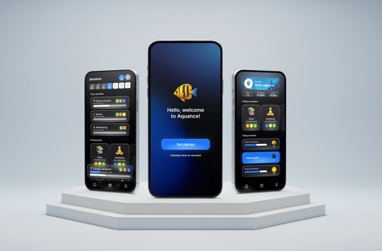
Future Outcomes
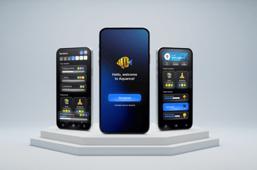
After finishing this project, I started thinking about how these ideas could go beyond just prototypes for existing platforms. One of the next steps I imagined was creating an independent app that could integrate or overlay these responsible features on top of other social media platforms. This idea evolved into the case study that I have on my website called Aquance, a prototype that explores how responsible design can work as a companion tool for digital wellbeing. It’s a natural continuation of the research and a space to keep testing how technology can adapt to people, not the other way around.
CURIOUS ABOUT MY FINAL DEGREE PROJECT?
Here's the full research and the prototype documents — take a look.
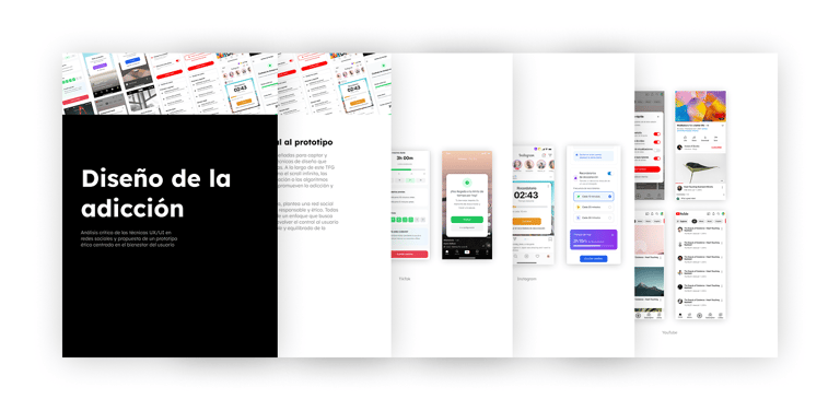
Addiction Design Final Degree Project Document - Spanish
This Final Degree Project (TFG) analyzes how social media platforms like TikTok, Instagram, and YouTube use UX/UI design techniques to maximize user retention, which can lead to addictive and harmful usage patterns for mental health. Strategies such as infinite scrolling, personalized notifications, gamification, and recommendation algorithms are examined, as well as the use of dark patterns that manipulate user decision-making.
From an ethical standpoint, the project proposes redesigned prototypes in Figma that promote more conscious use, including features like time limits, disconnection reminders, and greater transparency. Through theoretical research, comparative analysis, and user validation, the aim is to foster more responsible platforms that prioritize users’ psychological well-being over indiscriminate engagement.
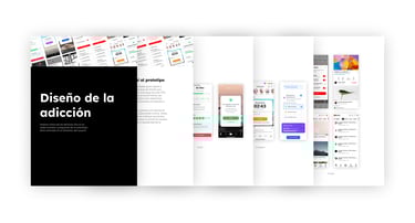
Developed Prototypes Document of the Social Media Prototypes
This document presents the prototypes of Instagram, TikTok, and YouTube, designed with ethical principles and user well-being at the center. The prototype, developed in Figma, proposes innovative solutions to minimize compulsive use, give control back to the user, and promote a conscious and healthy use of digital technology.
It includes screens and functionalities that prioritize transparency, personalization, self-control, and the reduction of addictive stimuli, offering a responsible experience aligned with the values of digital well-being.