AQUANCE
Designed a playful, gamified mobile prototype that helps users reduce social media use by promoting mindful focus through visual rewards and gentle interventions.

Modern focus and productivity apps feel clinical — timers, streaks, and punishments. Users drop off because the experience feels transactional, not rewarding. The challenge was to design an app that motivates continuous focus through emotional engagement rather than pressure.
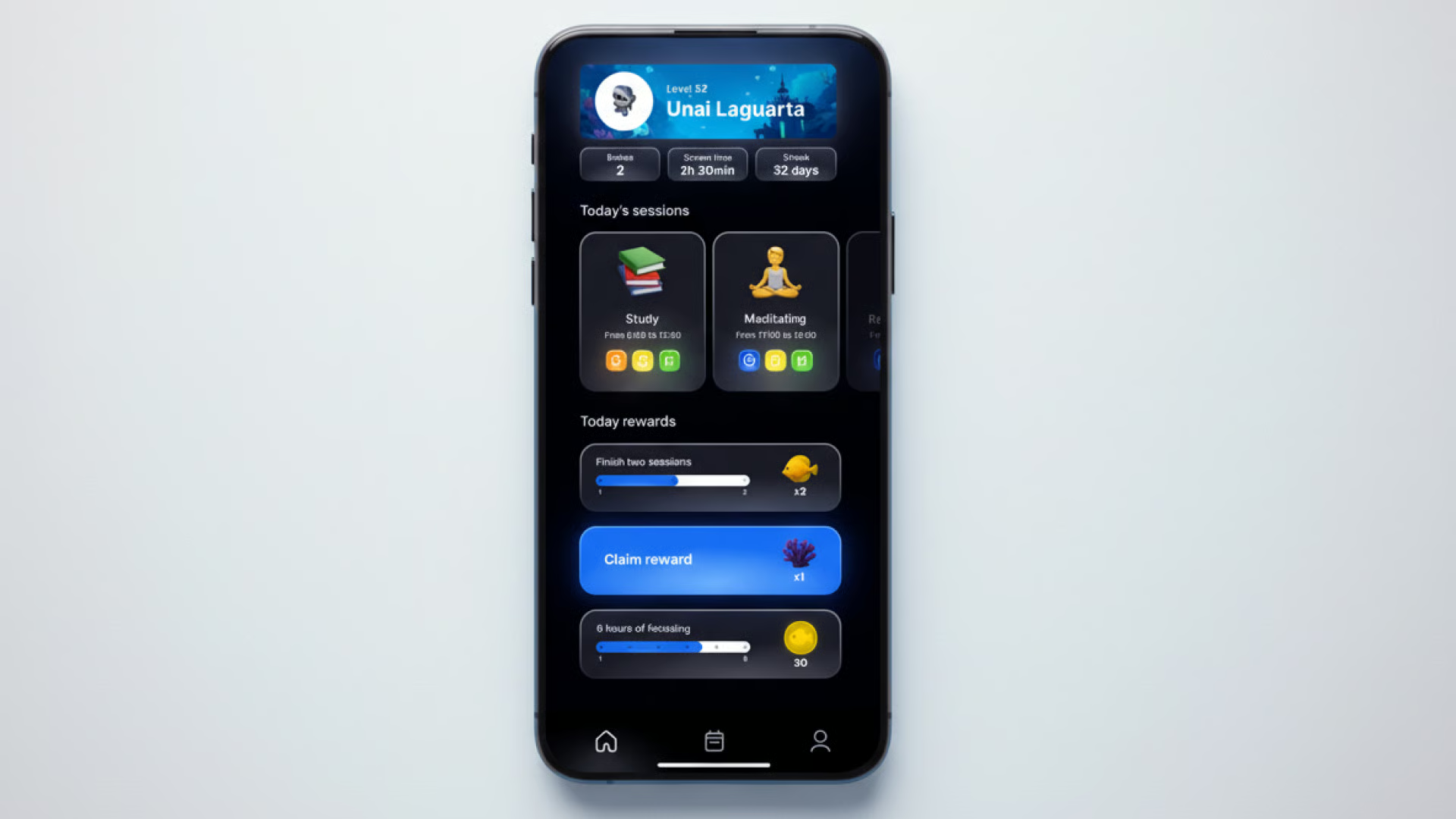
Create a mobile experience that transforms focus sessions into an intrinsic, visual reward. The user should feel the time they invest accumulating into something meaningful and alive — not a leaderboard, but a world they are growing.
End-to-end UX/UI — research, concept, wireframes, design system, and high-fidelity prototype. Solo project delivered in two weeks as part of a design sprint exercise.
Analyzed leading focus and habit apps — Forest, Flora, Focus Keeper, Finch. Identified a clear pattern: apps that rely on streaks or punishment lose engagement quickly, while apps built around a visual metaphor retain users longer because the reward is emotional, not numerical.
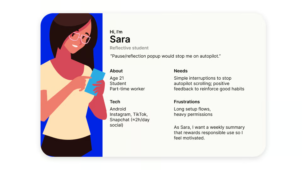
Conducted five semi-structured interviews with students and remote workers who had tried multiple productivity apps. The interviews focused on what motivated them to return to an app, and what made them abandon one.
“I deleted Forest after a week because losing a tree made me feel guilty, not productive.”
“I want to feel like I'm building something, not just checking off time.”
“The apps that worked for me were the ones that felt alive — like there was a reason to come back.”
Used How-Might-We prompts to reframe the problem around emotional reward. Ran a Crazy 8s session to explore eight distinct visual metaphors — from forests to constellations to aquariums. Storyboarded three candidate concepts to test which one resonated most with the target user.
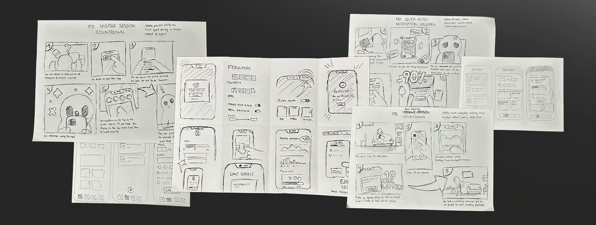
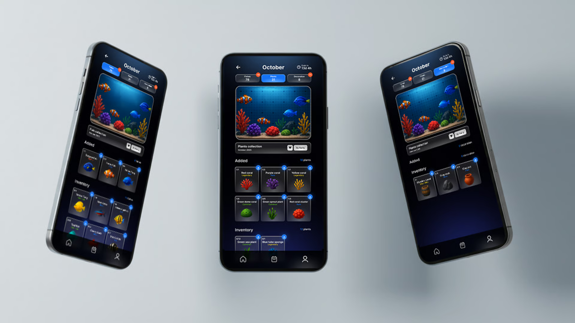
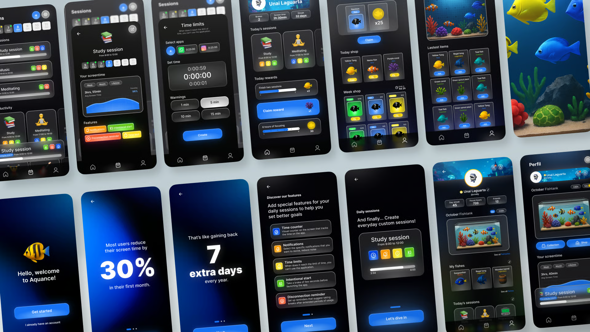
The aquarium metaphor won: each focus session grows a small piece of a reef — coral, fish, currents. The world is persistent, calm, and expands slowly over weeks. Losing a session does not destroy progress; it simply pauses growth, removing the punishment loop from competitors.
The concept was validated in a second round of feedback. Users responded strongly to the persistence of the world and the absence of loss mechanics. This became the foundation for the prototype.
I analyzed apps for digital wellbeing, focusing on app blocking, usage limits, and productivity tools. Competitors offer features like Focus/Sleep modes, Pomodoro timers, gamification, and cross-device support.
Key insights: simple, intuitive design matters, effectiveness is boosted by metrics or gamification, and multi-device availability is a major advantage.
Built a minimal design system around a cool, aquatic palette — deep navy, soft teal, pearl white — paired with a single display typeface and a generous type scale. Components were designed to fade and breathe, reinforcing the underwater metaphor without literal imagery.
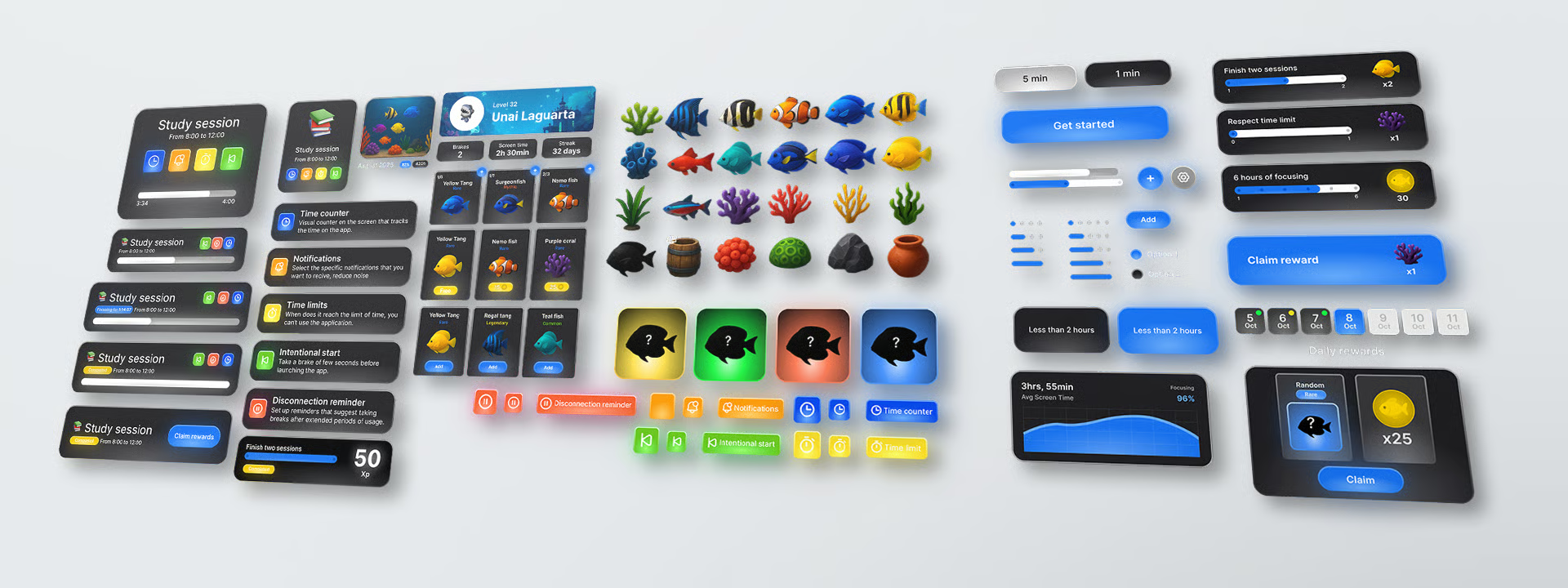
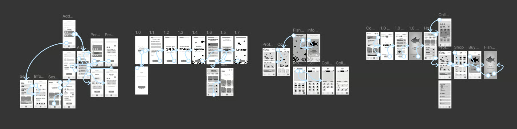
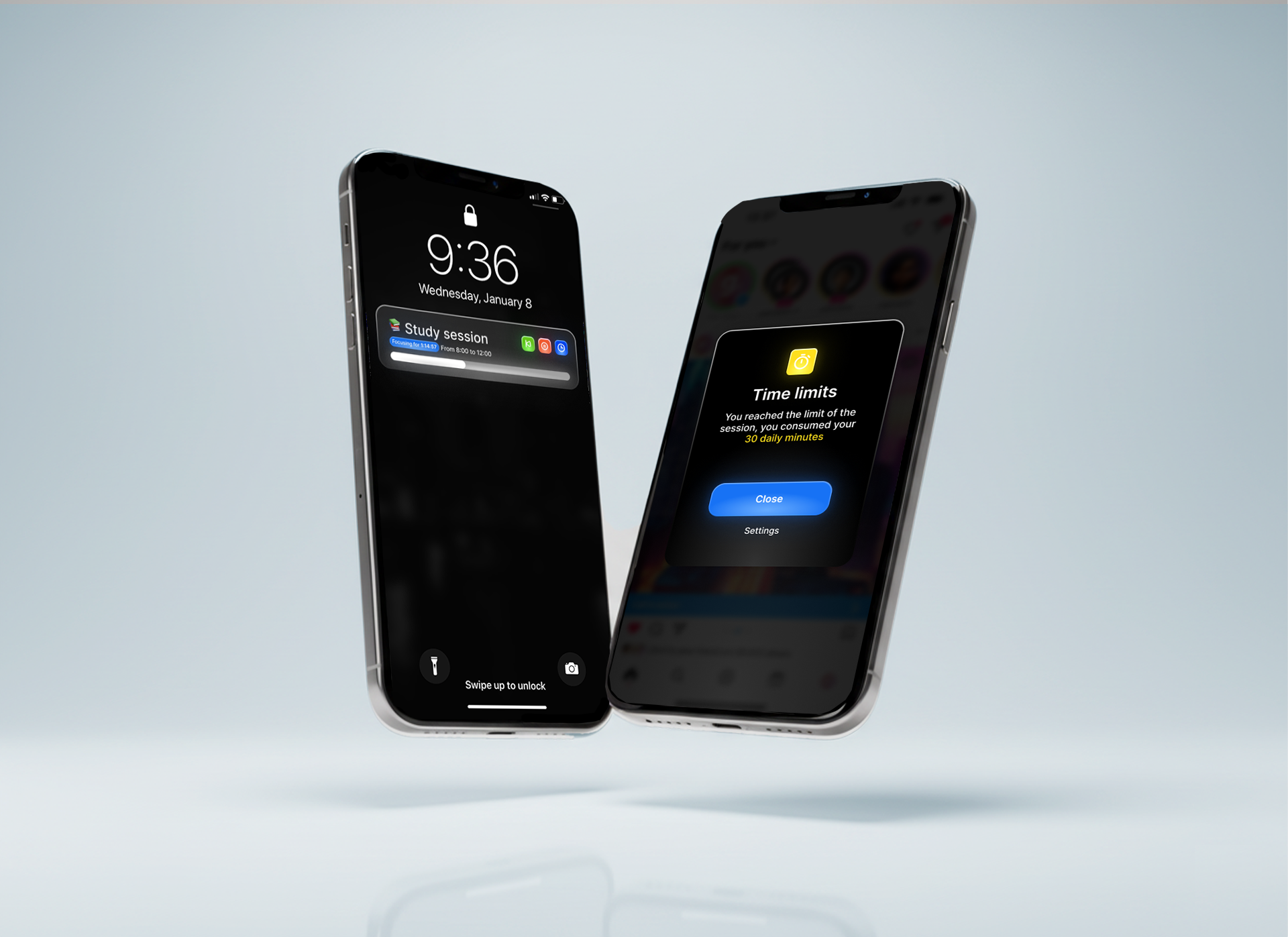
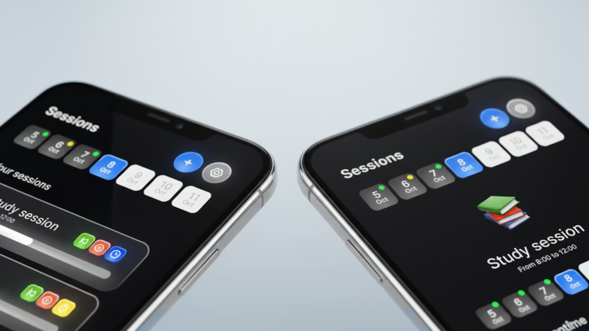
Delivered a fully interactive Figma prototype covering onboarding, the focus session, the world view, and the progress archive. Micro-interactions were prototyped in detail — the slow bloom of coral at session end, the gentle drift of fish as ambient motion, the haptic cue on completion.
Explore the interactive prototype in Figma
VIEWThe final prototype presented a coherent alternative to the punishment-driven productivity app — a focus experience that feels like tending to something alive. Feedback from the validation round highlighted the calm pacing, the absence of guilt mechanics, and the sense of ownership over a personal world.
The project reinforced how much emotional framing shapes user retention. Replacing loss with pause, and replacing numbers with a living metaphor, changed the entire relationship between user and app. It was a reminder that the most powerful UX decisions are often the ones that remove friction rather than add features.