Signs
An inclusive learning app designed to make sign language accessible and engaging for children. Playful interactions and clear visual hierarchy guide young users through every lesson.
Sign language learning tools for children are either too clinical — flashcards and repetition drills — or too entertainment-first, where the game overshadows the learning. Neither fits the way kids actually pick up a new language, which is through play, repetition, and contextual reinforcement.
Design an app that teaches basic sign language to children aged 6–10 through short, playful sessions. The app should feel like a game to the child while giving parents and teachers clear visibility into progress.
End-to-end: research, UX, visual design, 3D asset direction, and frontend development. Built in an interdisciplinary team with engineers and educators as advisors.
Reviewed academic work on second-language acquisition in children, focusing on the role of visual modality and repetition spacing. Key takeaway: short, frequent exposure beats long sessions, and children respond better to embodied feedback (motion, sound, characters) than to numeric scores.
Mapped fifteen existing products across two axes — educational depth and play-fulness. Almost every product clustered at one extreme or the other. The opportunity was clearly in the middle: something that feels like a game but doesn't dilute the learning.
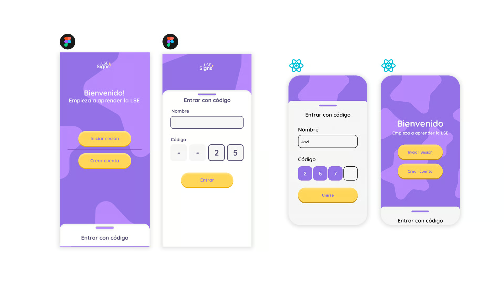
Ran informal interviews with parents, teachers, and one speech-and-language therapist. Their feedback shaped three non-negotiables: sessions must be under five minutes, progress must be visible to adults, and the characters must be culturally neutral.
“If it's longer than a YouTube short, we're not using it.”
“The sign has to be repeated in a way that doesn't feel like a drill — kids will notice the second they're being tested.”
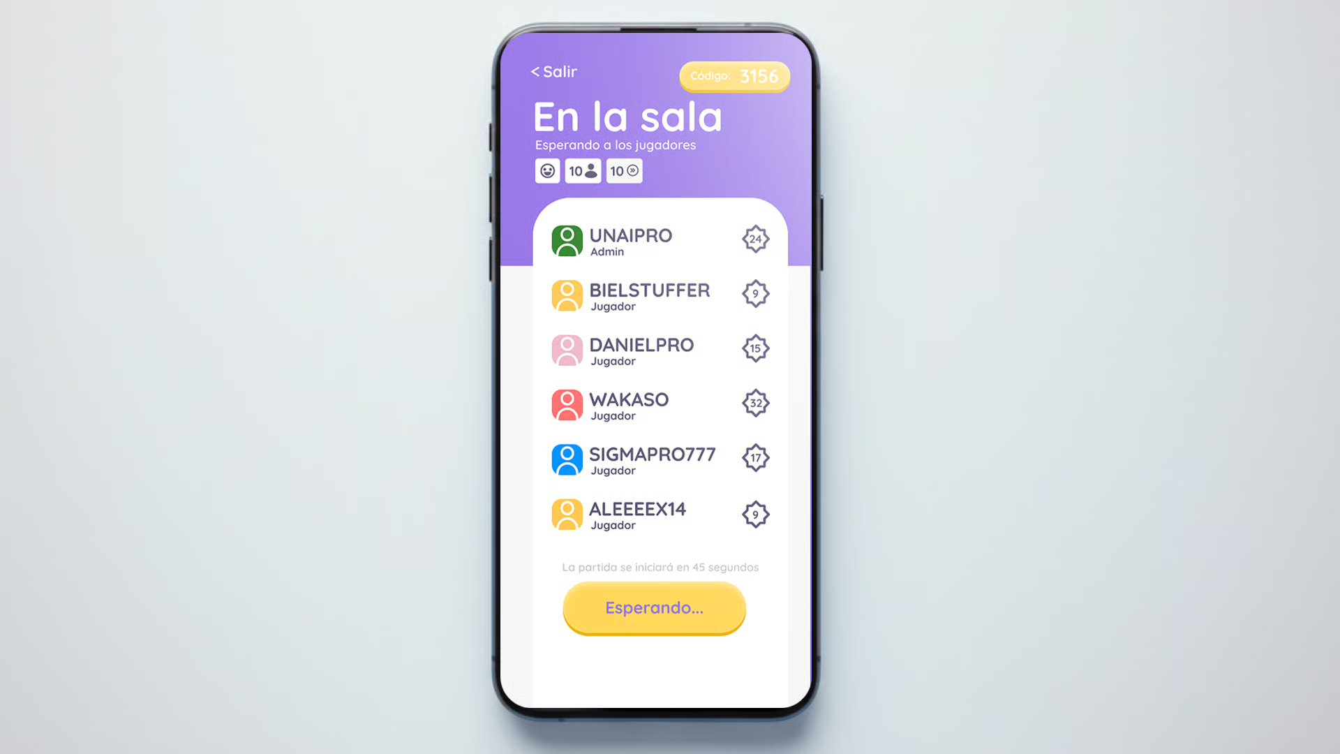
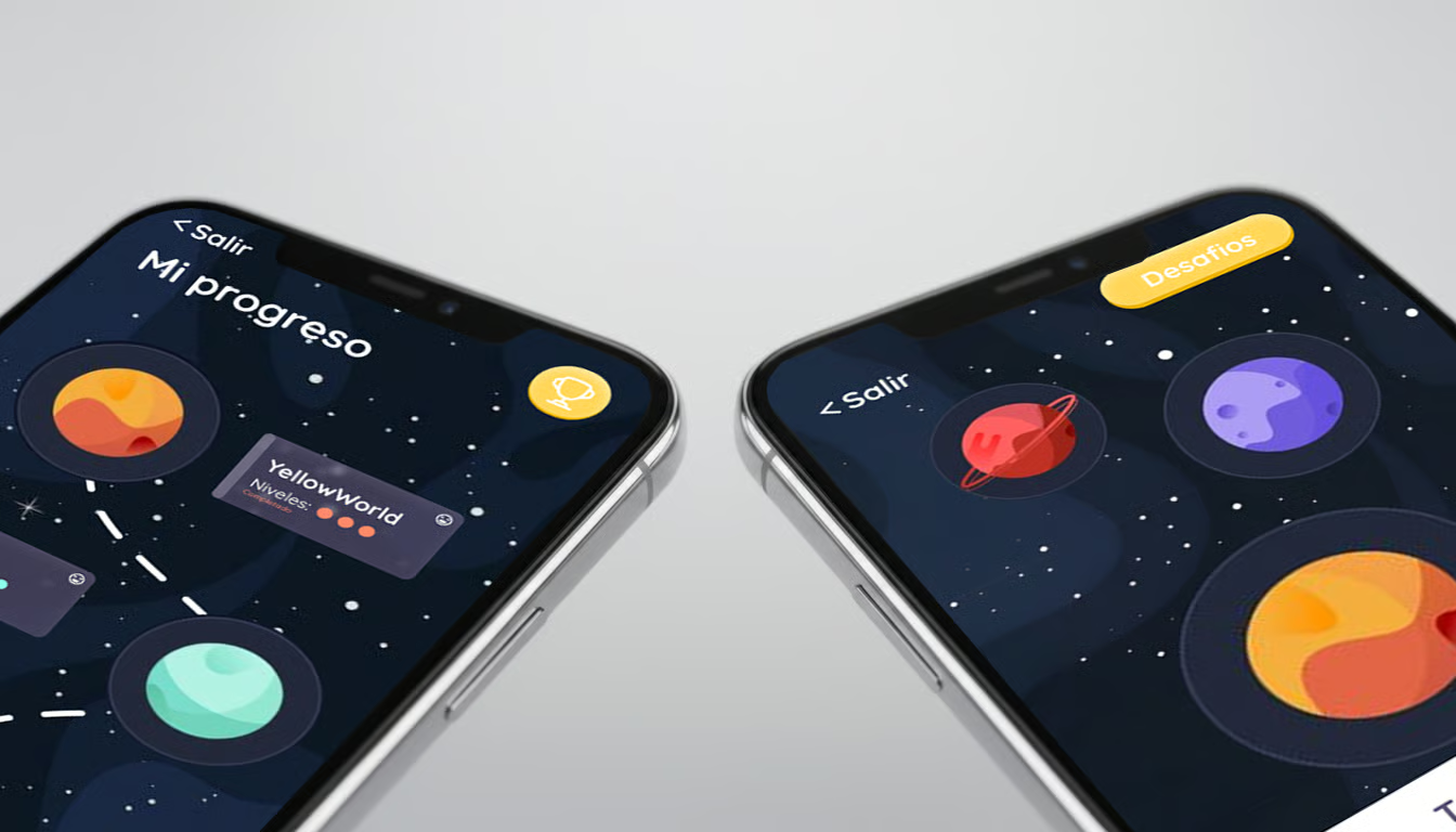
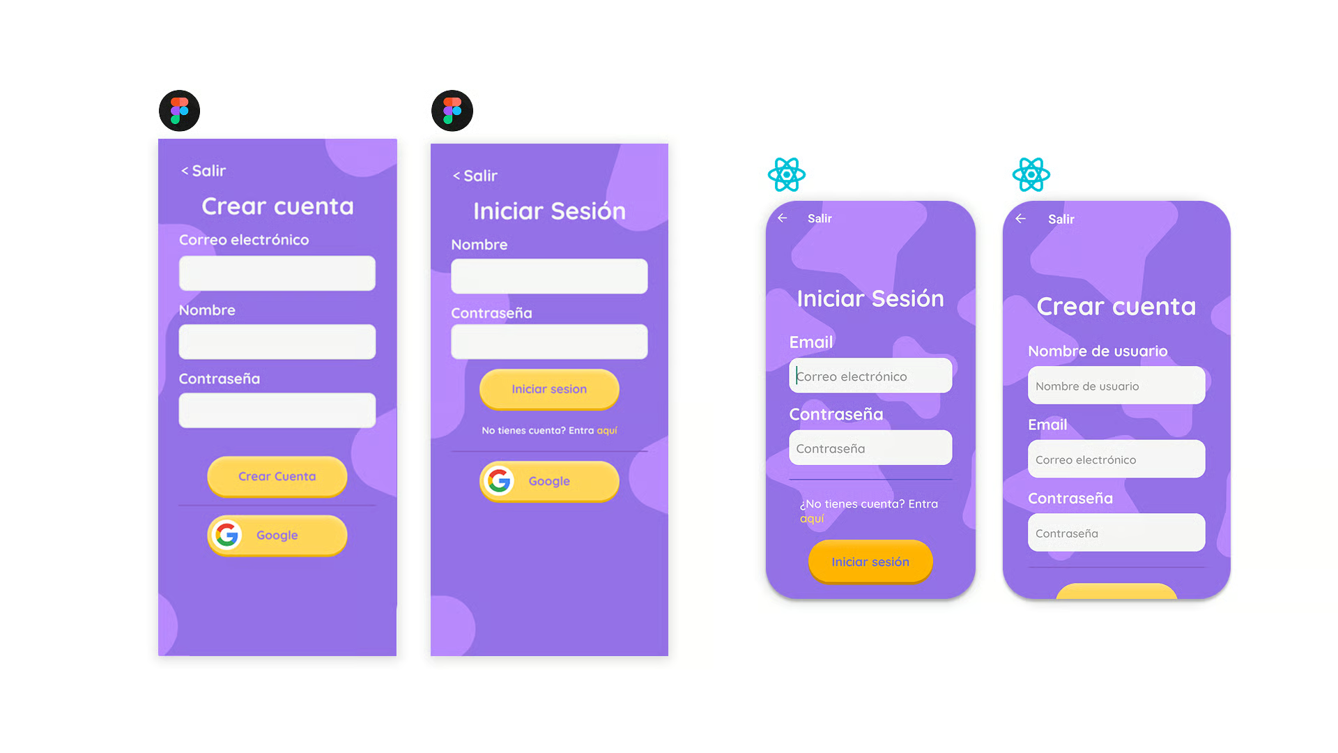
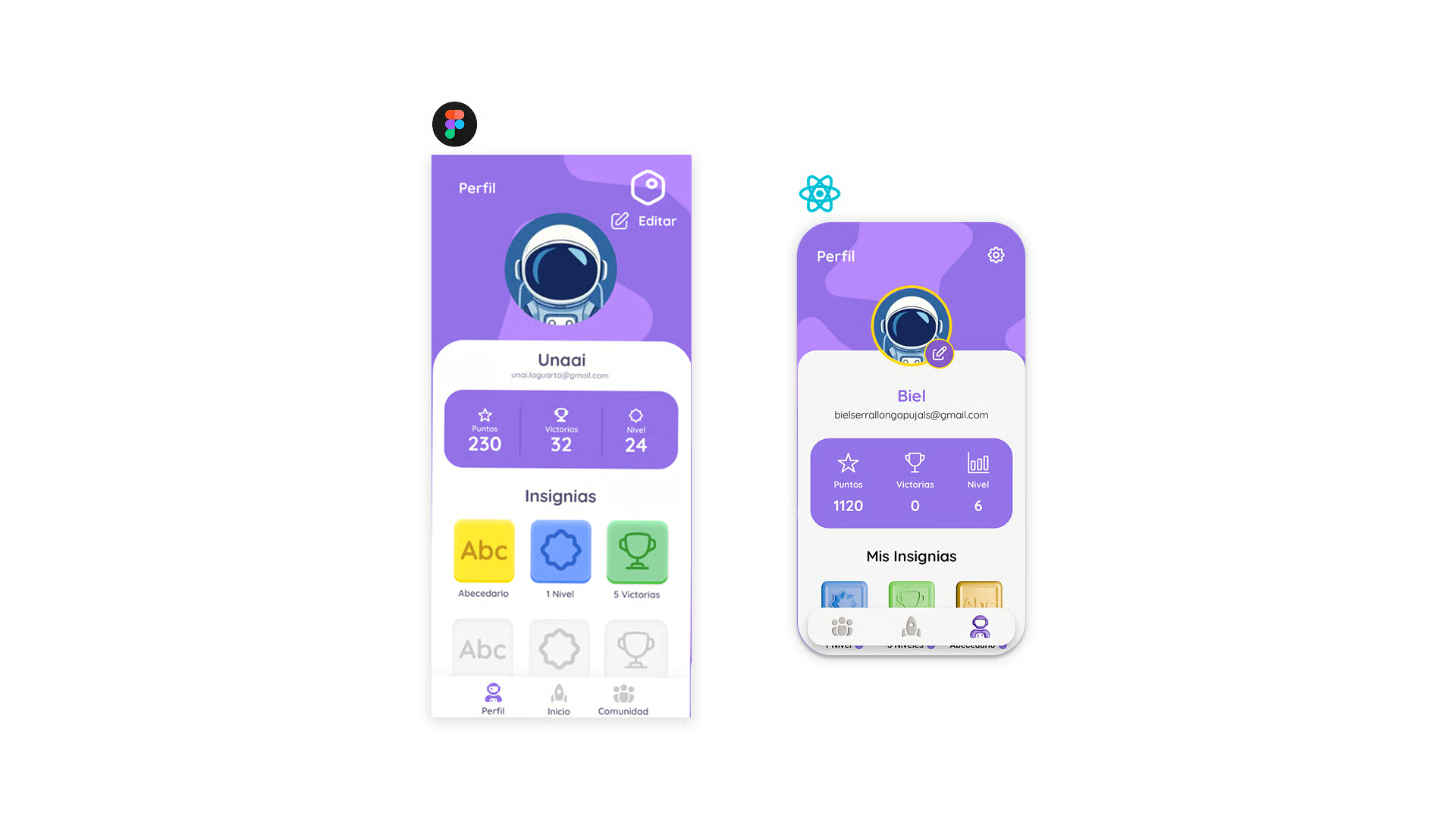
Synthesised the interviews into three personas — a young learner, a parent, and a teacher. Each persona has its own entry point into the app: the learner lands on a play screen, the parent lands on a progress dashboard, the teacher lands on a classroom view.
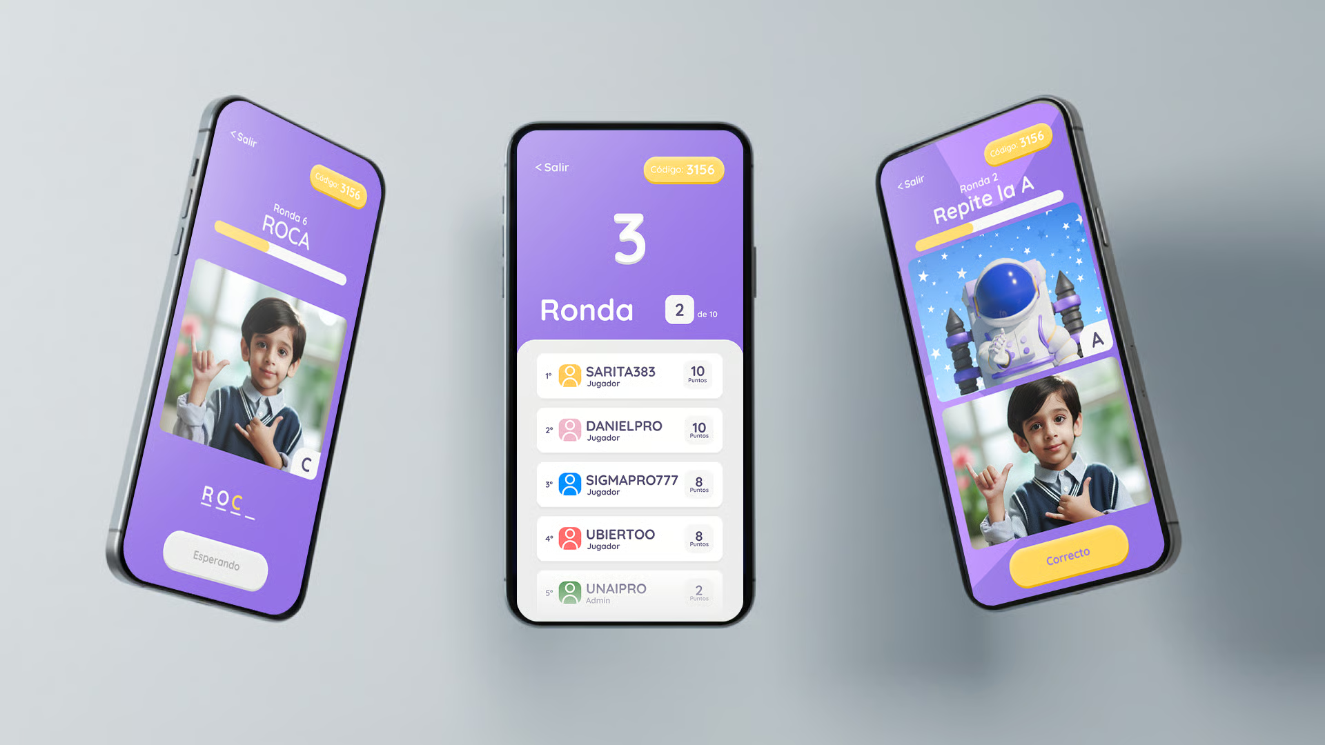
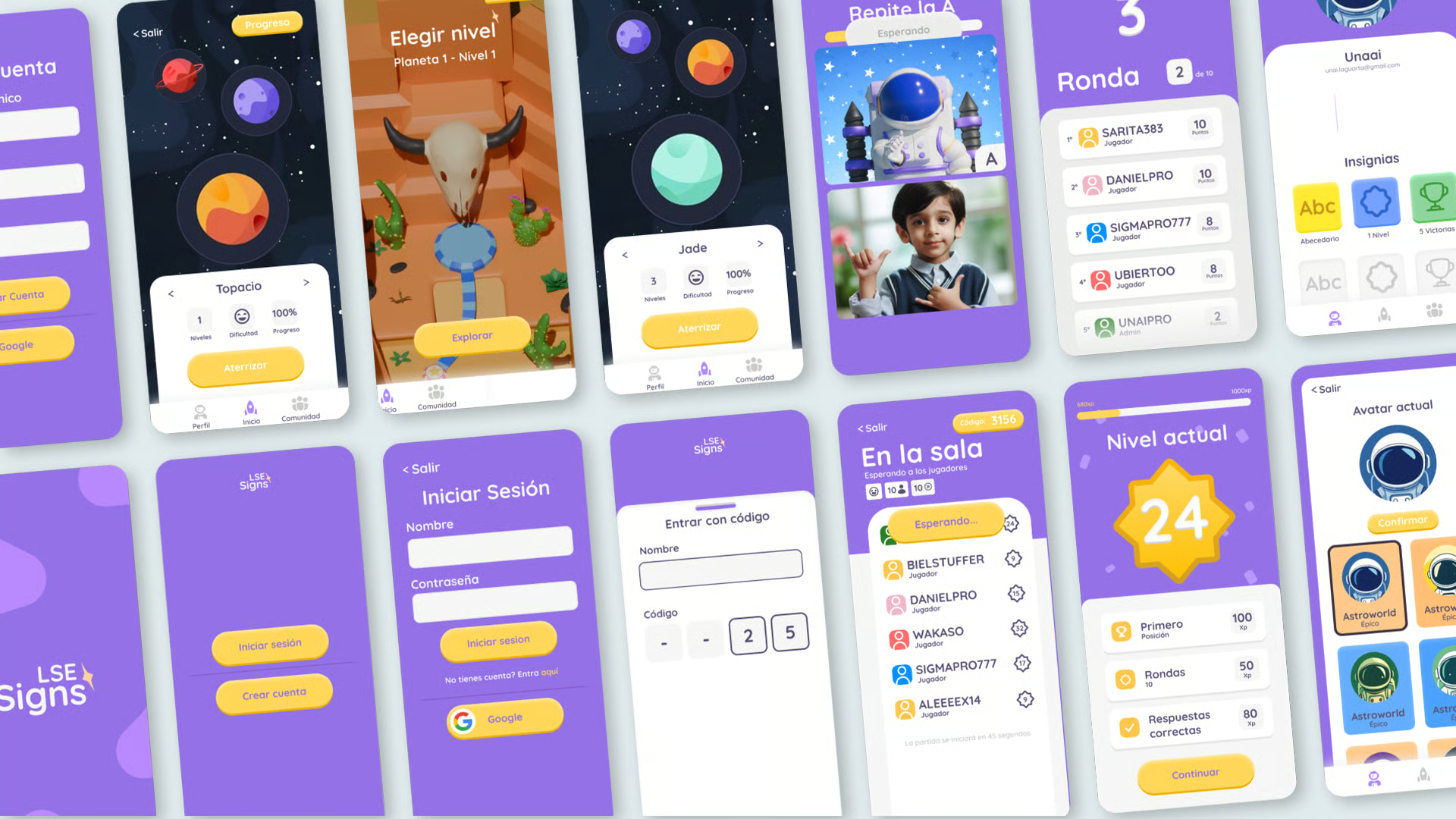
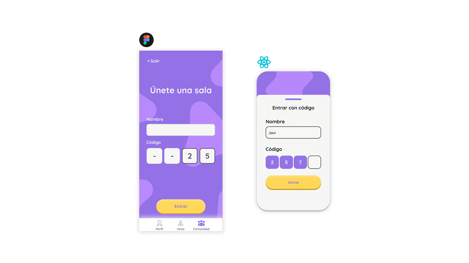
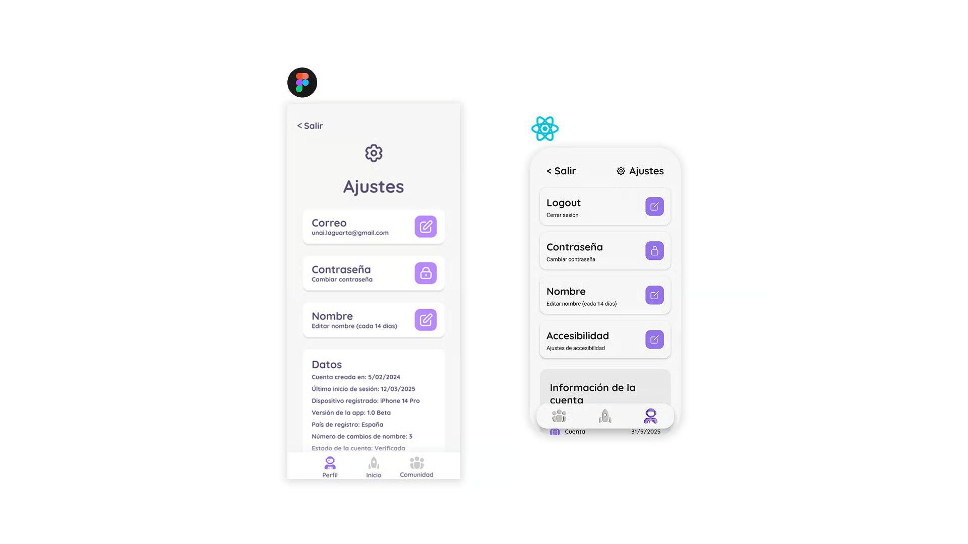
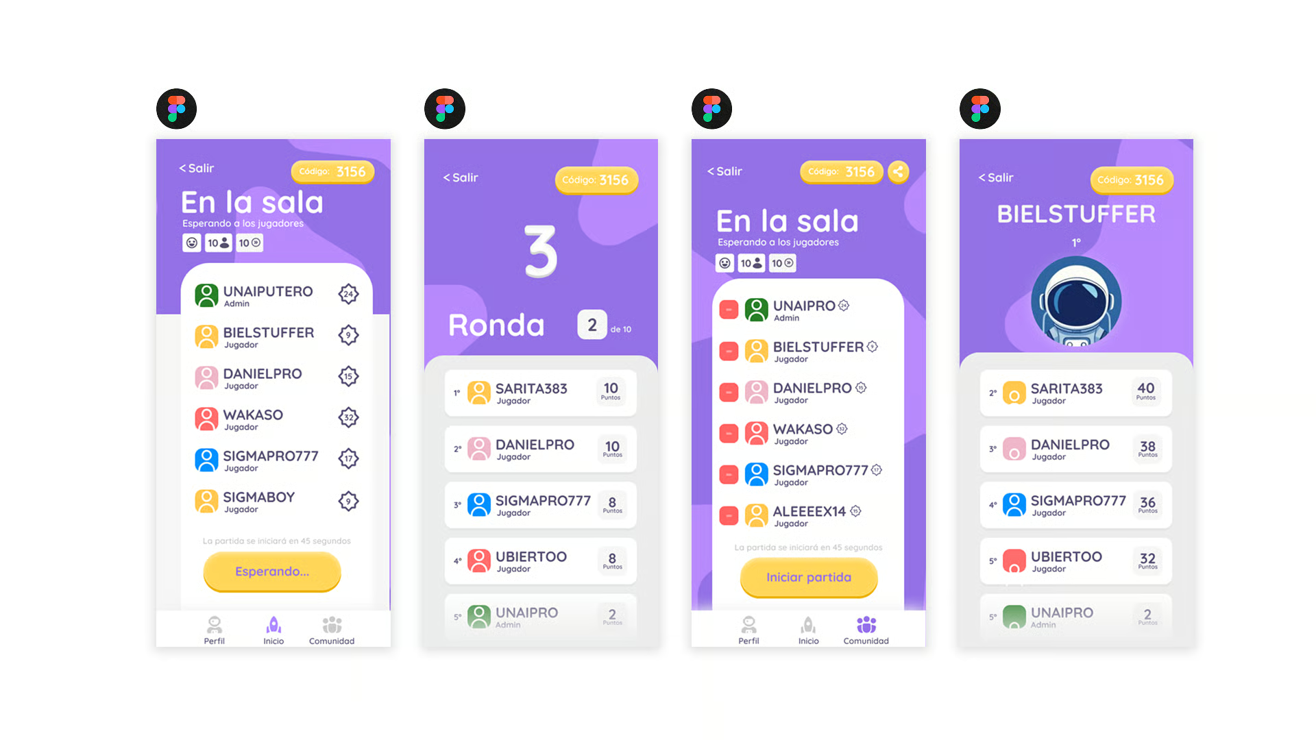
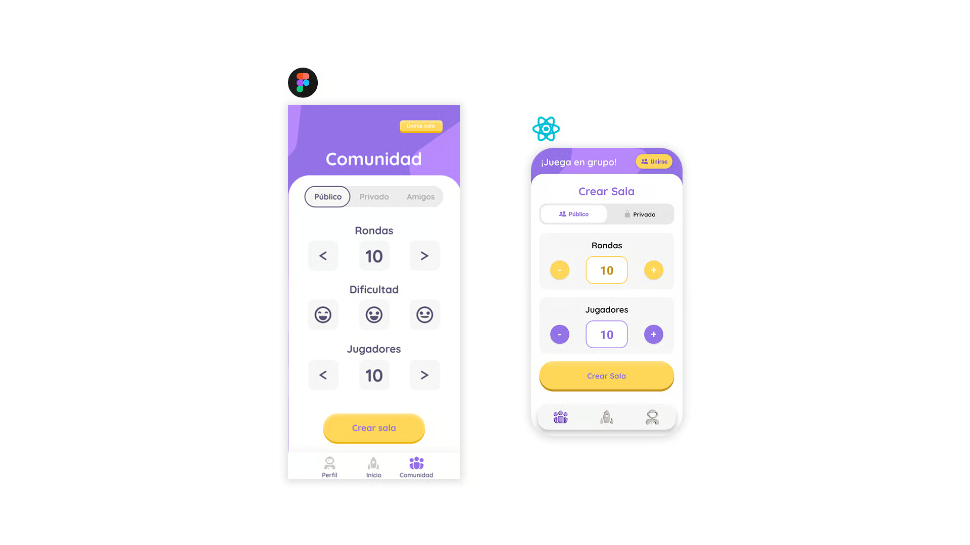
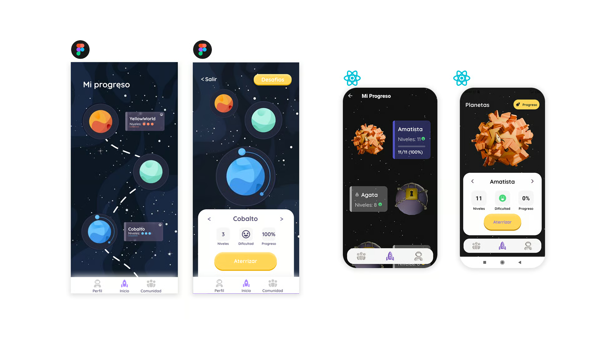
Structured the app around five main flows: onboarding, daily lesson, practice mode, progress, and settings. The daily lesson is the primary loop — everything else supports it. User flows were validated with paper prototypes before moving to wireframes.
Built the app with accessibility as a first-class concern, not an afterthought. High-contrast mode, adjustable text size, captions on every animation, and a reduced-motion toggle are baked into the design system. Given the target audience, this was essential rather than optional.
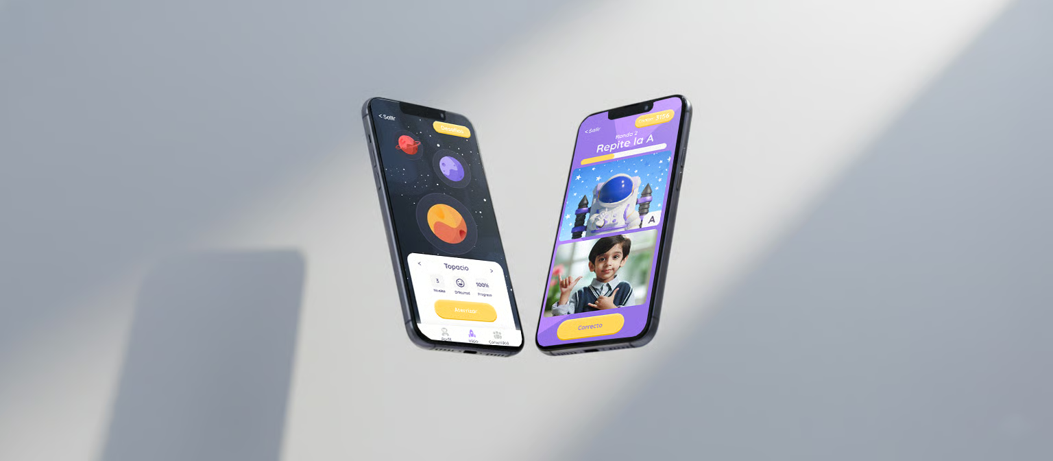
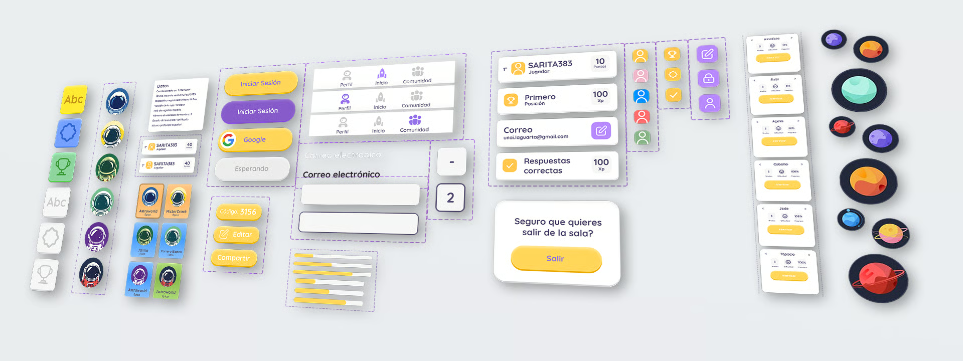
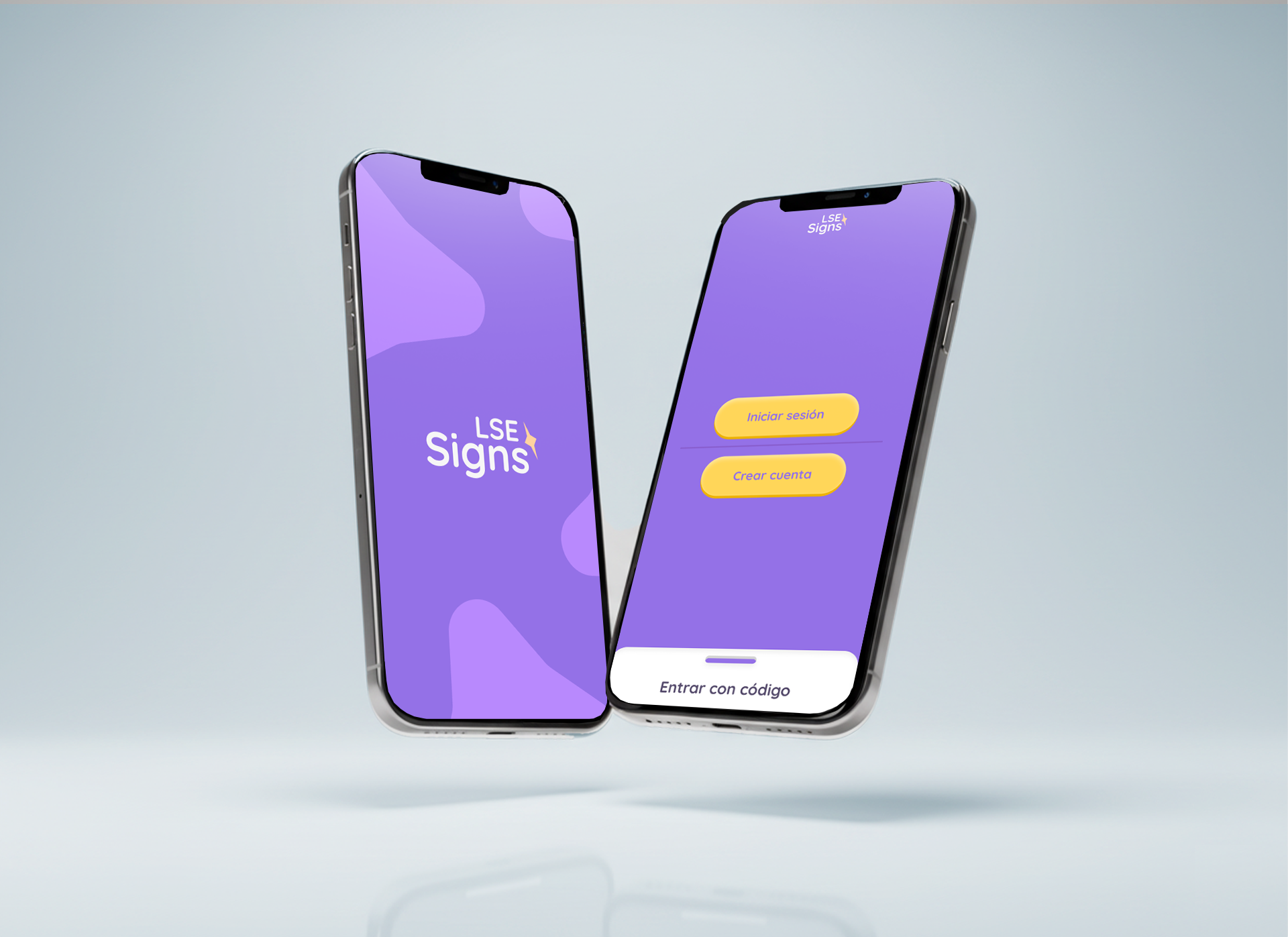
Built a warm, playful design system — rounded shapes, soft shadows, a saturated but friendly palette. Typography is a single rounded sans with a wide x-height for legibility. Components are intentionally large and forgiving for small fingers and developing motor skills.
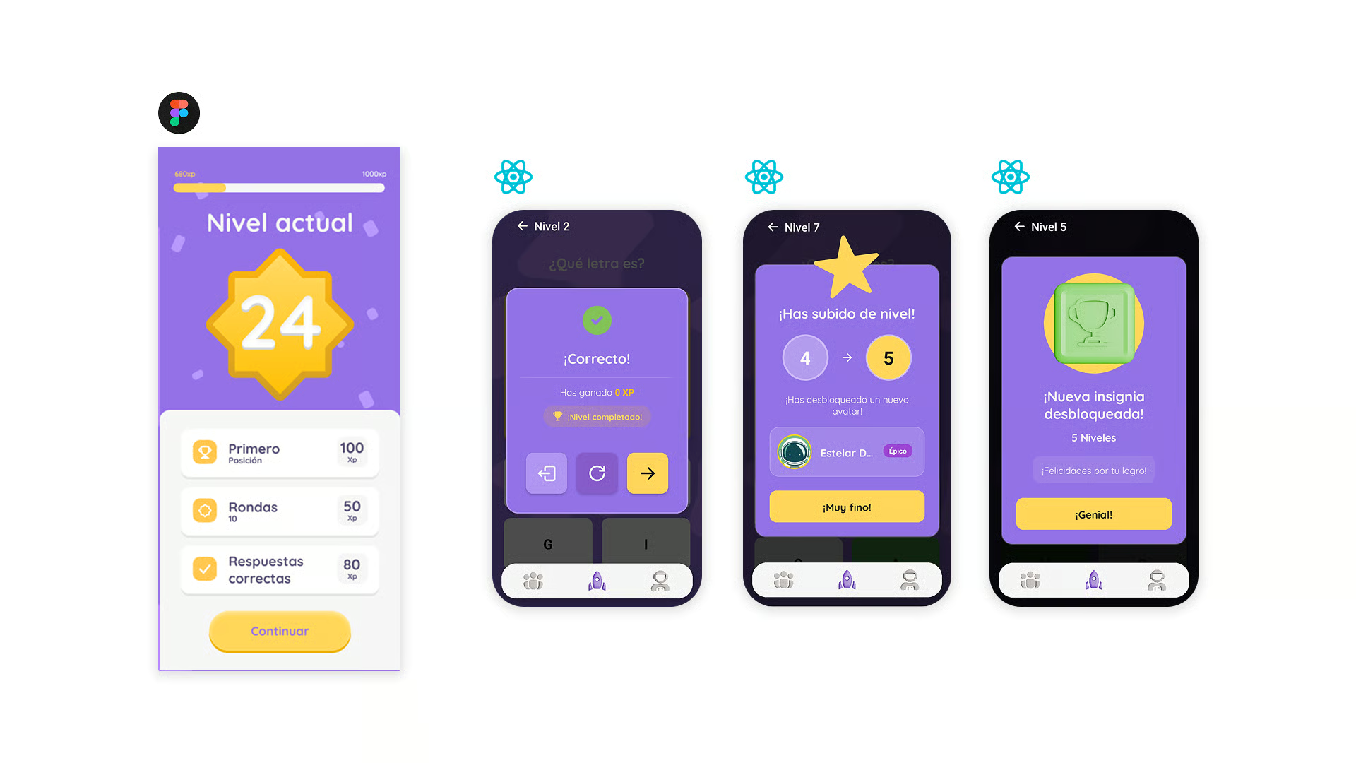
Delivered an interactive prototype covering onboarding, the daily lesson loop, practice mode, and the parent dashboard. Micro-interactions were prototyped carefully — the characters react to correct and incorrect answers with motion and expression, never with red Xs or punishing sounds.
Explore the interactive prototype in Figma
VIEWThe app was built as a React Native application with a shared component library, allowing the same codebase to ship to iOS and Android. State is managed per-session rather than globally, keeping the architecture simple and easy to reason about.
A lightweight Node backend handles progress syncing, authentication, and content delivery. Lesson content is versioned so new signs can be added without a client update — important for keeping the app fresh without forcing parents to update every week.
Sign demonstrations are delivered as short 3D-rendered clips rather than live video, so characters can be culturally neutral and fully controllable. Assets were directed in collaboration with a 3D artist and optimised aggressively to keep the app under the typical download threshold for children's apps.
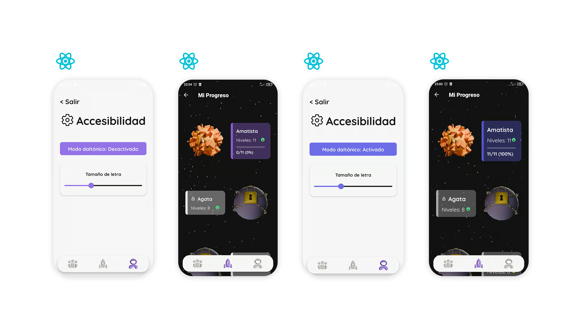
The final prototype was tested with a small group of children aged 6–10. Engagement was high — every tester completed more sessions than asked — and adults reported that the progress dashboard gave them the visibility they were missing in existing tools. The educators who advised on the project endorsed the final experience without reservations.
Designing for children taught me that clarity and warmth are not in tension — they reinforce each other. Every removed element made the app easier to learn from and more enjoyable to use. Accessibility, far from being a constraint, pushed every design decision toward a better version of itself.