Exótico
A bold brand identity and digital experience for an energy drink concept. Visual language, motion, and UI converge into a cohesive, high-impact product story.
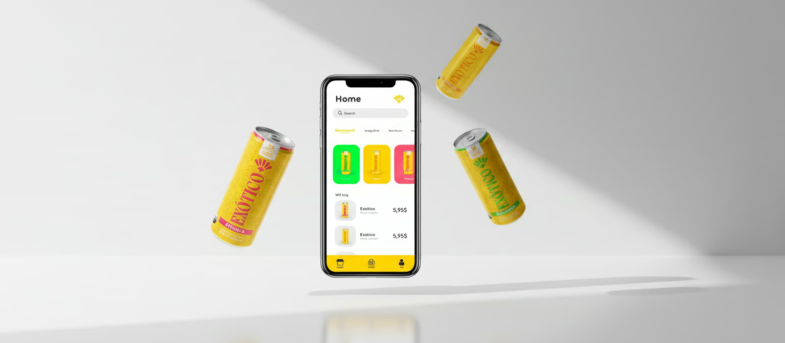
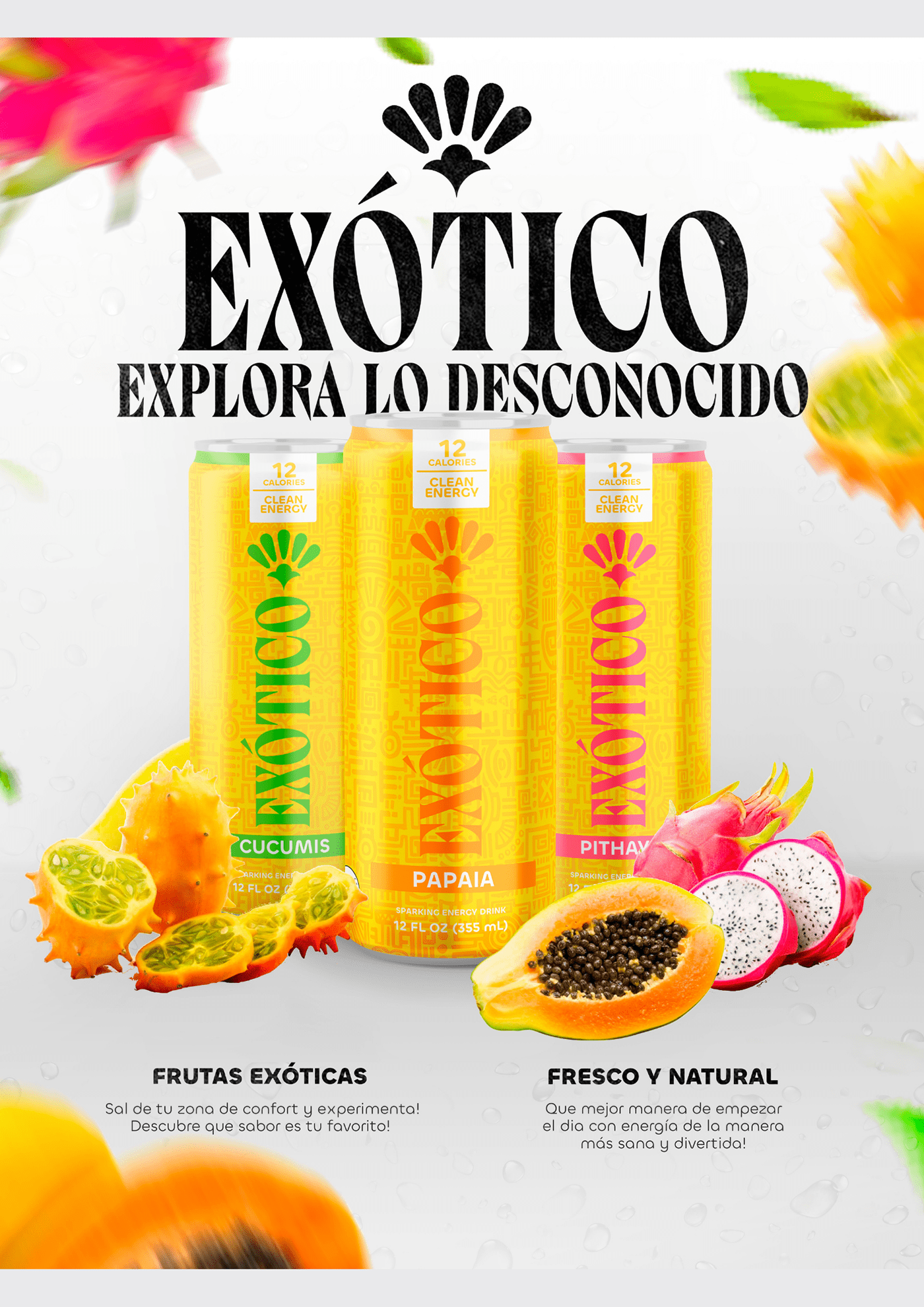
Exotico is a conceptual energy drink brand built around fruit profiles that feel deliberately un-corporate — bright, honest, and rooted in flavours that are not already claimed by the category. The project covers the full brand system: naming, logo, palette, packaging, and a companion mobile app that turns the product into a daily ritual rather than a transaction.
The goal was to create a brand that feels confident without shouting, and an app that rewards curiosity rather than consumption.
The energy drink category is dominated by aggressive visual language — racing stripes, lightning bolts, fluorescent colour. Anything outside that vocabulary struggles to be recognised as an energy drink at all. The challenge was to carve out a distinct identity without disqualifying the brand from its own category.
Design a brand that reads as confident and energetic through composition and type, not through cliches. Extend that language into packaging and a digital product that feel like part of the same universe.
End-to-end brand and product design — naming, visual identity, packaging, UI, and motion. Solo project, delivered over six weeks.
Exotico — a name that leans into the fruit-forward positioning while carrying warmth and movement. It sounds like a place, not a product, which opens room for storytelling.
Energy, unfiltered. The slogan doubles as a product claim and a tone-of-voice anchor. It signals honesty about ingredients and keeps the brand away from performance-sport cliches.
Young adults who want an everyday energy drink but are tired of the sports-coded aesthetic — creatives, students, cafe regulars. They care about flavour, ingredients, and brand tone in roughly equal measure.
The brand lives across packaging, the mobile app, an e-commerce storefront, in-store displays, and social content. Each surface uses the same grid, palette, and type system, so the brand reads as one thing across channels.
A geometric sans for the logotype paired with a more humanist sans for body and UI. The contrast is subtle — enough to build hierarchy without introducing a third voice.
Exotico
Energy, unfiltered.
Bright & honest flavours
Bright & honest flavours
Bright & honest flavours
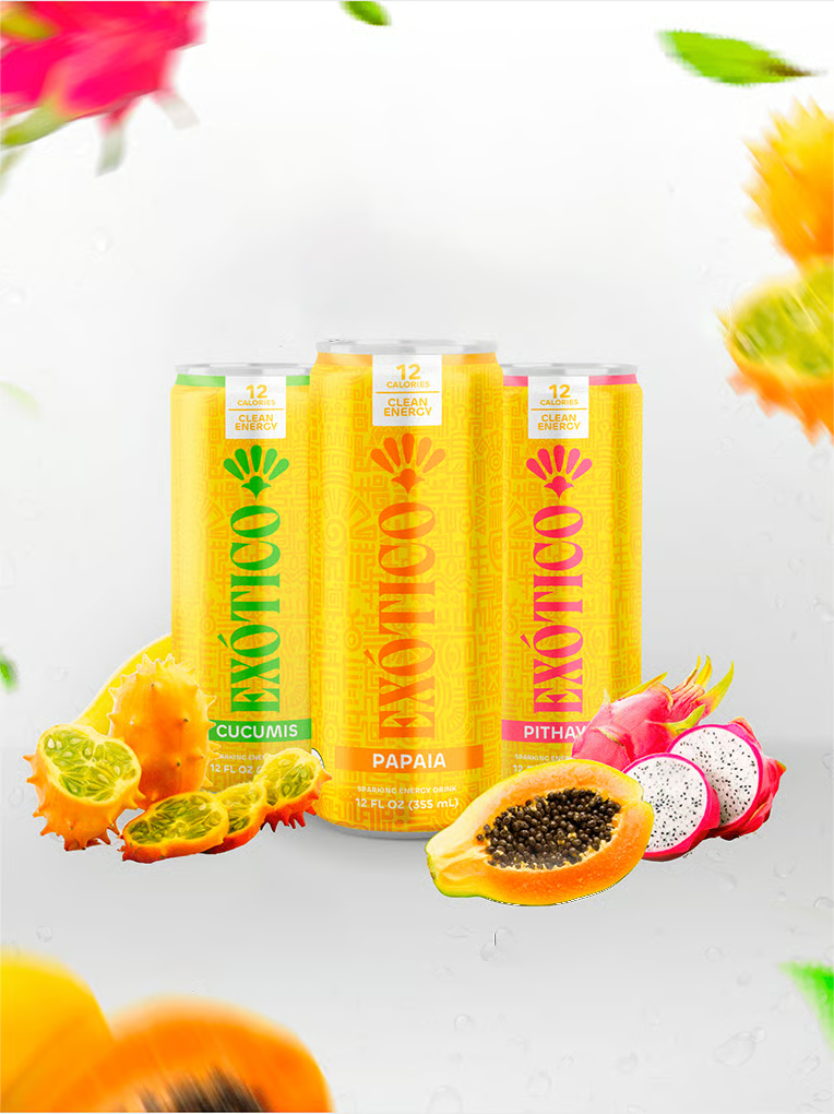
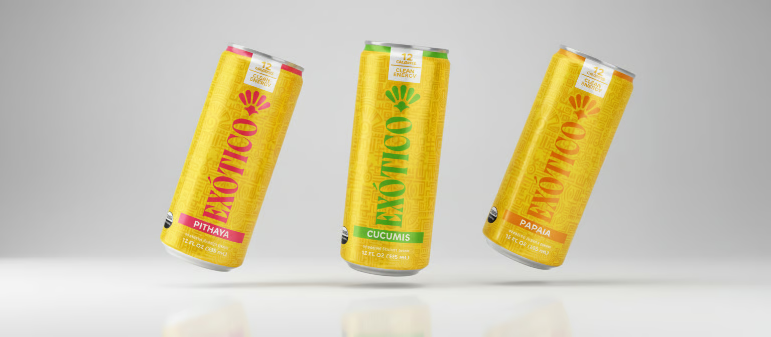
Each flavour gets its own saturated hue pulled directly from the fruit — deep mango, passionfruit red, lime green. Neutrals are warm off-whites and soft charcoal, so the fruit colours always read as the accent.
A monogram built from the crossed stems of tropical fruit — recognisable from a distance, simple enough to sit on a can, flexible enough to animate. It is designed to work equally well as a print mark and as an app icon.
Curved shapes carry warmth and movement, and they quietly echo fruit silhouettes without illustrating them literally. They also give the brand room to extend into motion graphics without breaking the visual language.
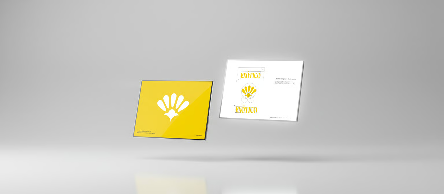
Check out the visual identity here
DOWNLOADThe mango can leans on a deep orange base with soft, humid lighting — the goal was to suggest ripeness without falling into cartoon fruit imagery. The logo sits calmly near the top, giving the flavour name room to breathe.
For passionfruit, a saturated red anchors the can while a single curved highlight carries the shape language from the logo. It is the most vivid of the line-up and acts as the hero on-shelf.
The lime version uses a cooler, higher-contrast green. It reads as the sharper, more awake flavour in the range, and the ingredients list is given more prominence to match the cleaner flavour profile.
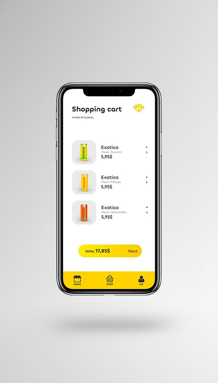
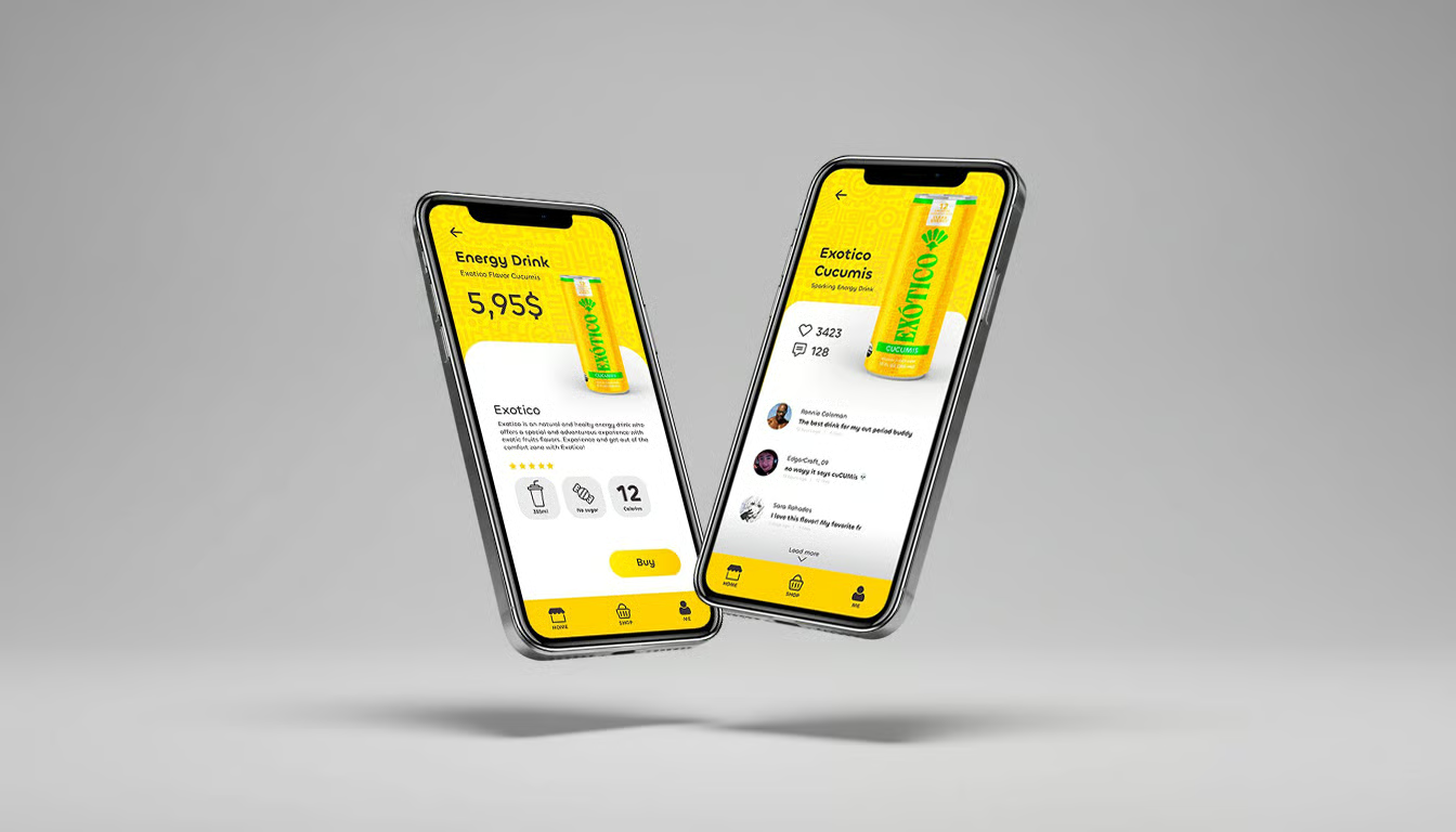
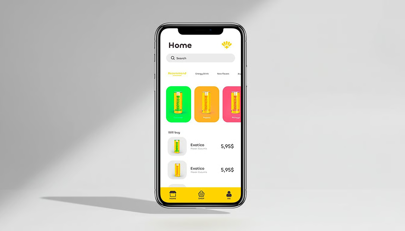
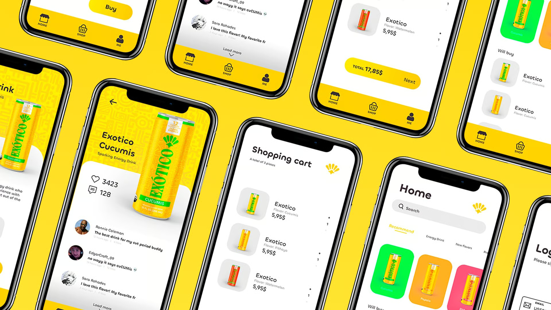
The app extends the brand into a daily ritual: users track which flavours they have tried, unlock seasonal drops, and get context about sourcing and ingredients. The app is intentionally low-friction — no login walls, no social feed, no dark patterns.
The UI mirrors the packaging system — warm neutrals with one saturated accent that shifts by flavour. Motion is slow and considered, so opening the app feels closer to picking up a well-made object than tapping through a menu.
Exotico landed as a coherent brand system where every surface — can, label, app, storefront — clearly belongs to the same world. The strongest signal in testing was that people described the brand in emotional terms (warm, curious, honest) rather than functional ones, which was the goal from the start.
Working on the brand and the product in parallel forced every decision to earn its place on both surfaces. It was a reminder that a brand is only as strong as the weakest touchpoint it lives on — and that discipline at the system level always shows up in the details.