Nadres
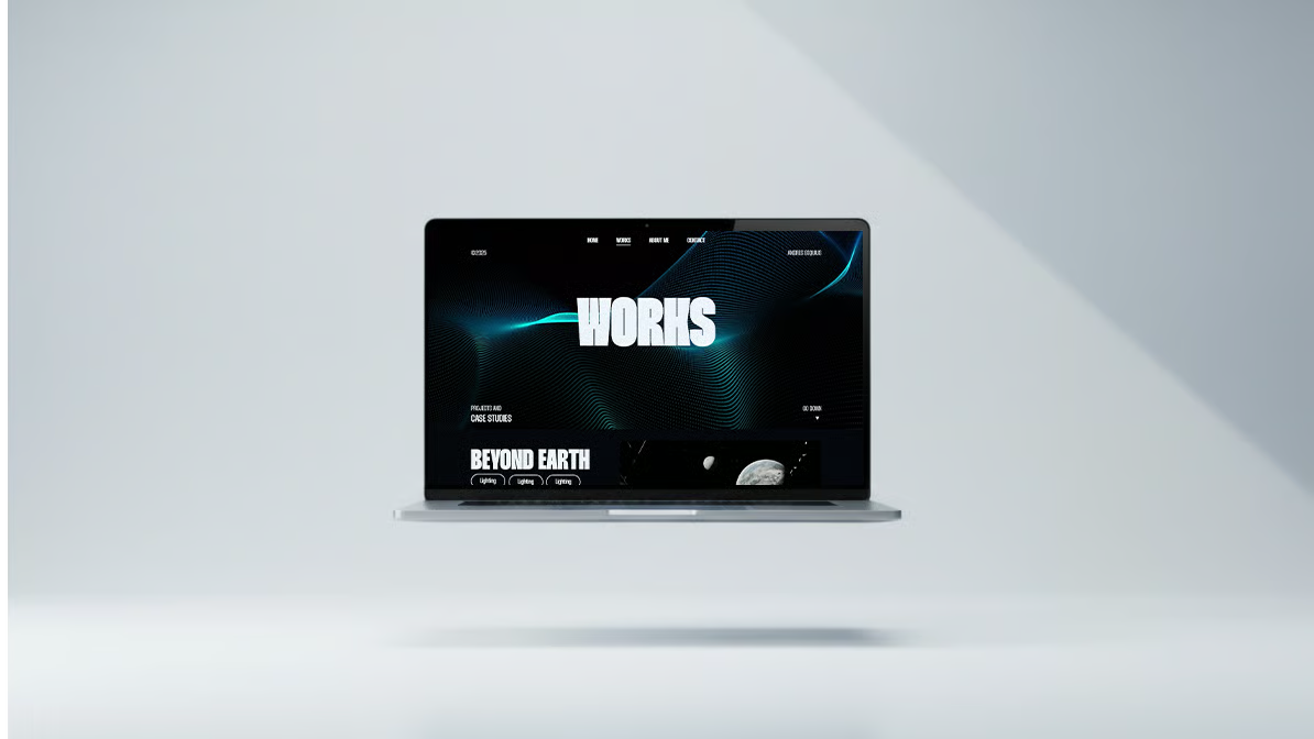
A minimal, motion-driven portfolio built to present creative work with clarity. Designed and developed end-to-end with a focus on typographic precision and seamless interaction.

Most portfolio websites fall into the same trap: either overly decorative or too generic. They prioritise visual noise over the work itself, making it harder for recruiters and collaborators to understand what the person actually does. The challenge was to design a portfolio that gets out of the way of the work while still feeling distinctive.
Build a personal portfolio that reads as a single coherent system — clean typography, considered motion, and a tone of voice that stays consistent from the home page to the last case study. The site should feel editorial, not promotional.
End-to-end: information architecture, visual design, motion, frontend development, deployment. Solo project, designed and shipped over four weeks.
Audited around twenty portfolios from designers and developers I admire — from agency-level sites to personal experiments. Broke each one down into three layers: navigation rhythm, typographic hierarchy, and interaction tone. The common pattern in the strongest ones was restraint: fewer surfaces, more attention on the work.
From there I mapped what I wanted my own site to say about me at a glance: multidisciplinary, detail-driven, interested in both design and engineering. That became the brief.
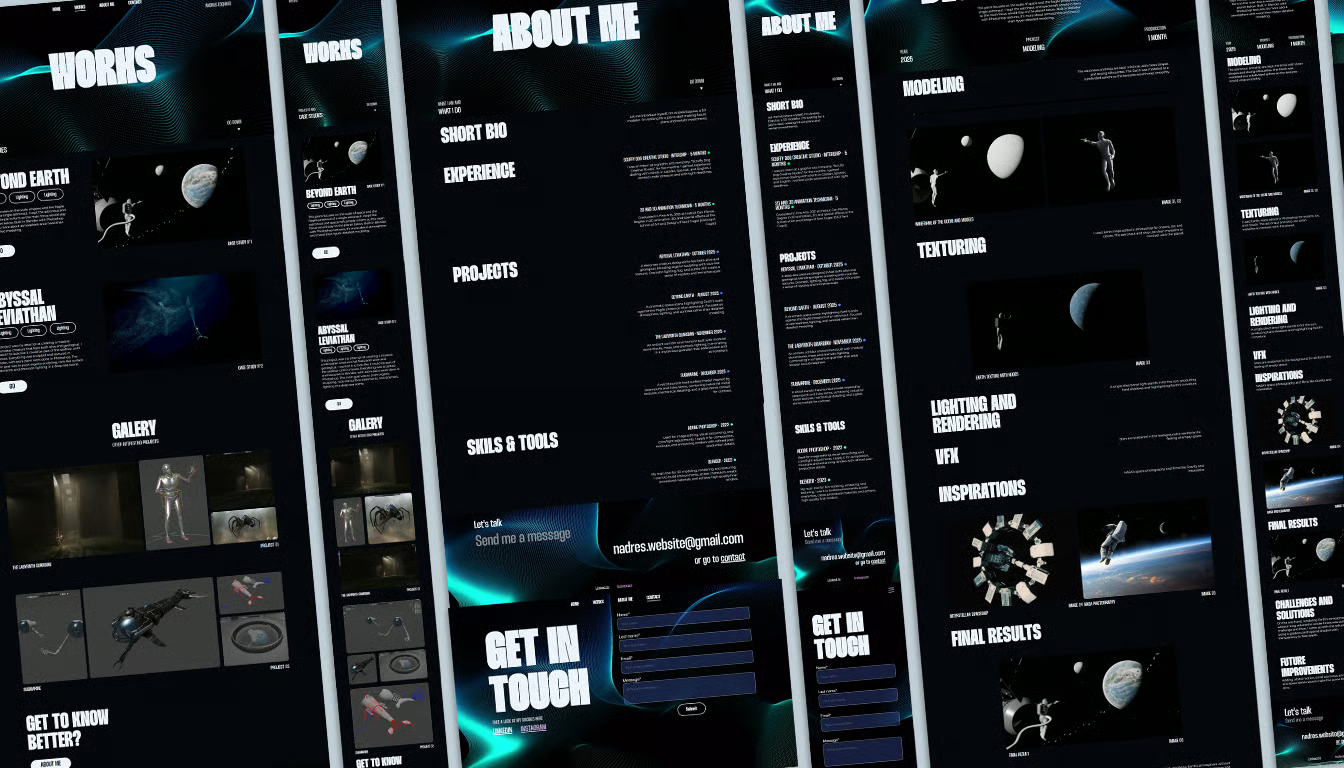
Structured the site around four anchors — Home, Works, About, Contact — so that any visitor can reach any piece of content in one click. Each case study follows the same rhythm, so navigating between projects never feels disorienting.
Sketched the main pages on paper, then moved to low-fidelity wireframes in Figma to lock in the grid, section rhythm, and reading flow before touching type or colour. The goal was to validate the structure independently of the visual layer.
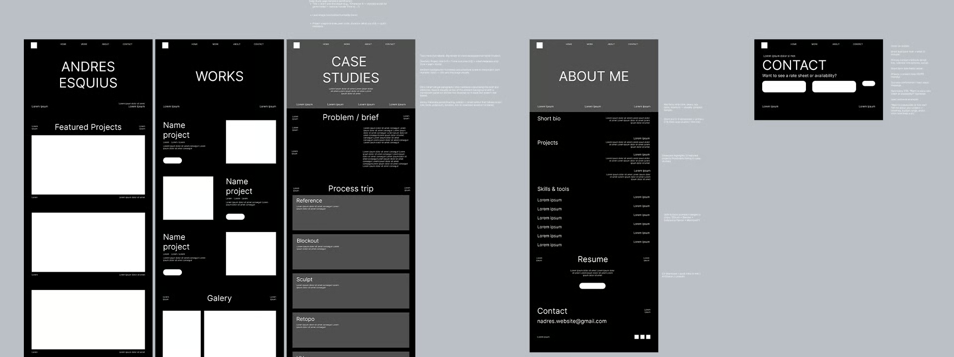
Shared the wireframes with designers, developers, and non-technical friends to pressure-test the hierarchy. The biggest takeaway was that the case studies needed clearer section markers — numbered headers and dividing lines — so readers could track where they were in a long page.
Built a minimal design system around a single neutral palette, two typefaces (a display serif and a geometric sans for UI), and a consistent scroll-reveal behaviour for body copy. Components are intentionally few: section headers, case entries, gallery images, quotes, buttons.
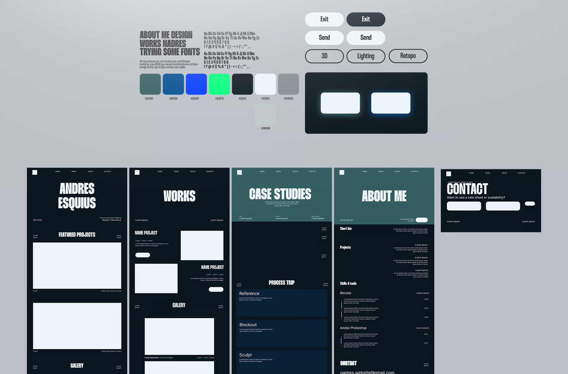
Once the system was in place, I applied it to the wireframes in a single pass. Very little changed at the structural level — which was the point. The visual layer should reinforce the architecture, not argue with it.
Built with Next.js App Router and Tailwind CSS. The motion layer is handled by Framer Motion with scroll-driven color transitions, and smooth scrolling is powered by Lenis. The whole stack is intentionally compact — no CMS, no heavy state management — so the site stays fast and easy to maintain.
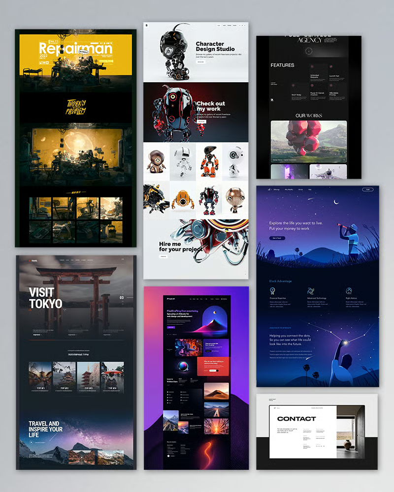
Each case study is its own route, composed from a small set of shared building blocks — hero, section header, case entry, gallery image, quote. Adding a new project means writing content, not re-implementing the layout.
Scroll-reveal text, hover-driven image scaling, and a unified image viewer with keyboard navigation and zoom. Interactions are subtle by design — they should be noticed only on a second pass.
Deployed on Vercel with automatic previews on every commit. Lighthouse, accessibility, and SEO checks are part of the release flow, so regressions are caught before they reach the live site.
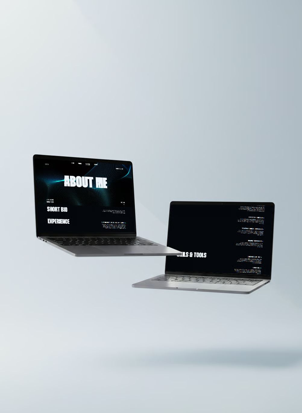
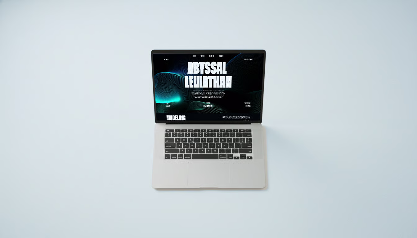
The final portfolio reads as a single consistent system across four projects, loads quickly, and works on both desktop and mobile without layout compromises. Feedback from recruiters and designers has been that the site feels calm and easy to read — which was the brief from day one.
The hardest part of a portfolio is knowing what to leave out. Every decision — palette, type, motion, component count — is a subtraction. The more I removed, the more the work itself came forward. That lesson now shapes how I approach every new project.